Enclave Networks: Building a brand for a cybersecurity startup.
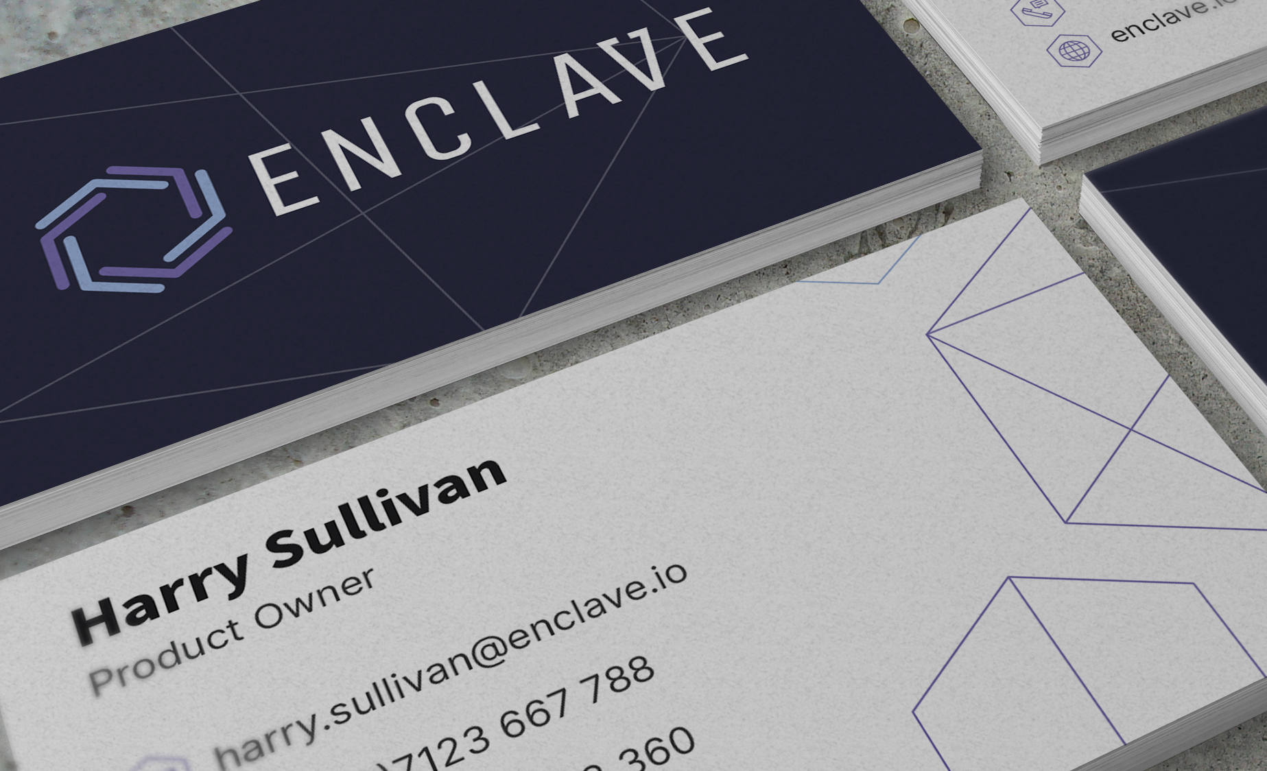
When I joined Enclave, the product was evolving quickly, but its visual identity hadn't kept pace. As the company's only designer, I was responsible for creating a cohesive brand that would support both the product and the wider business.
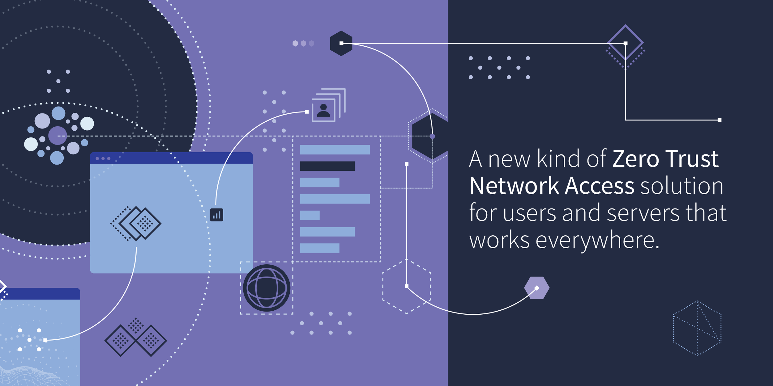
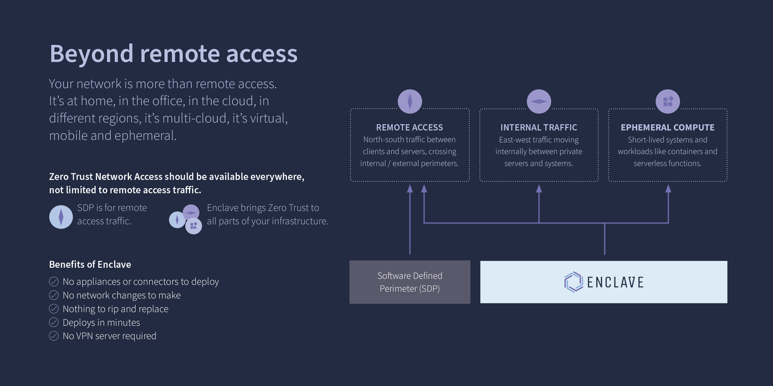
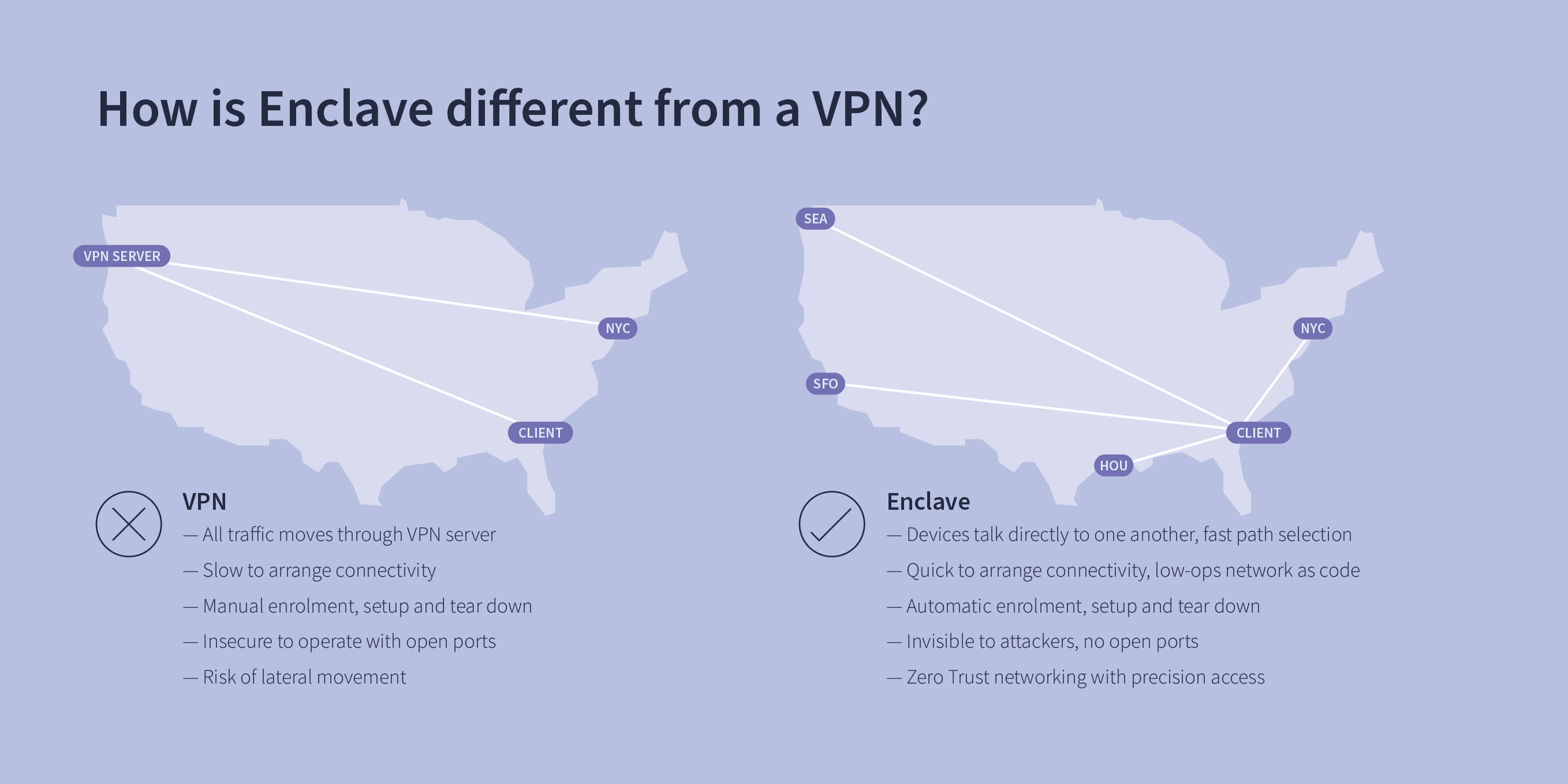
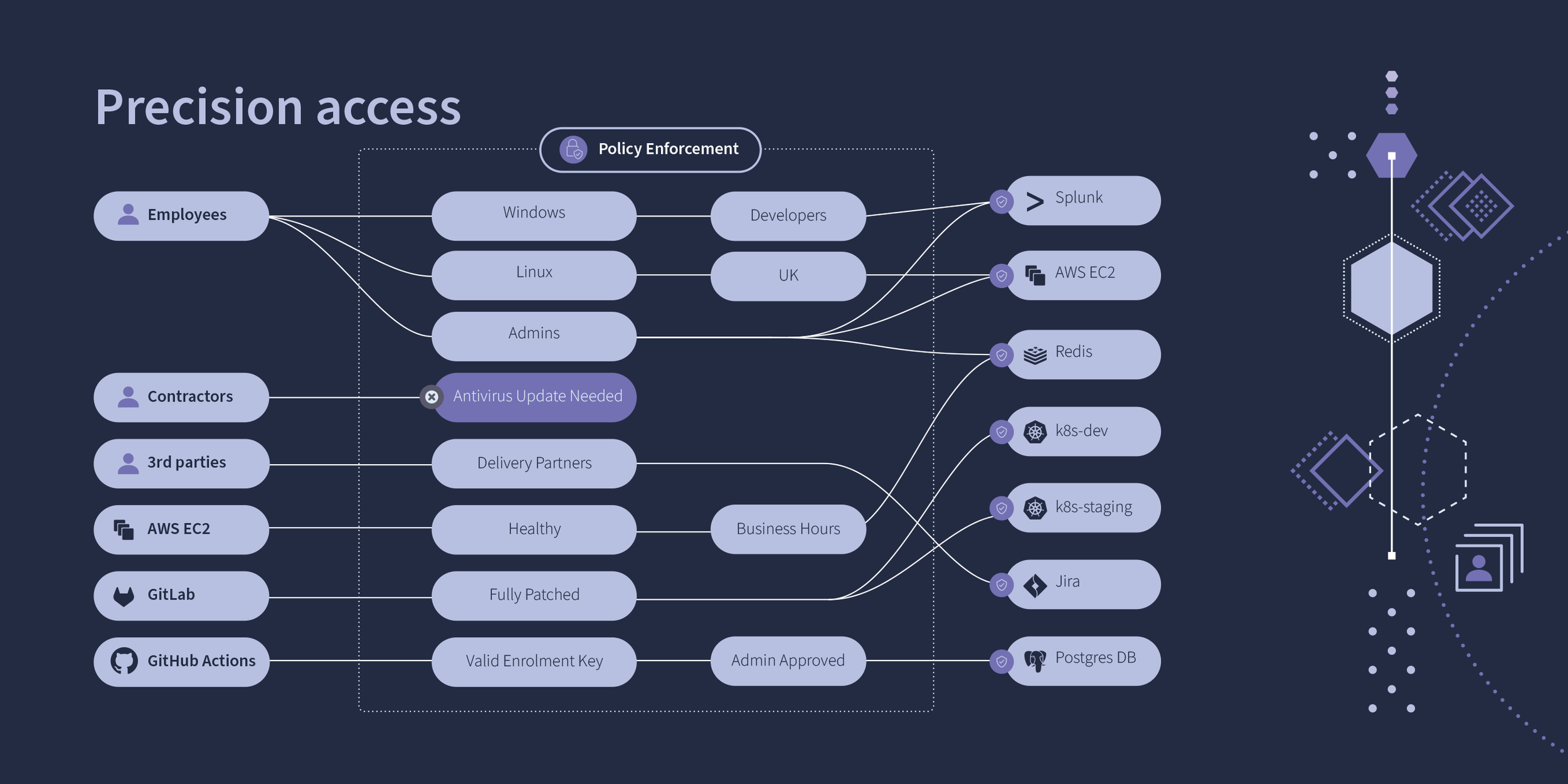
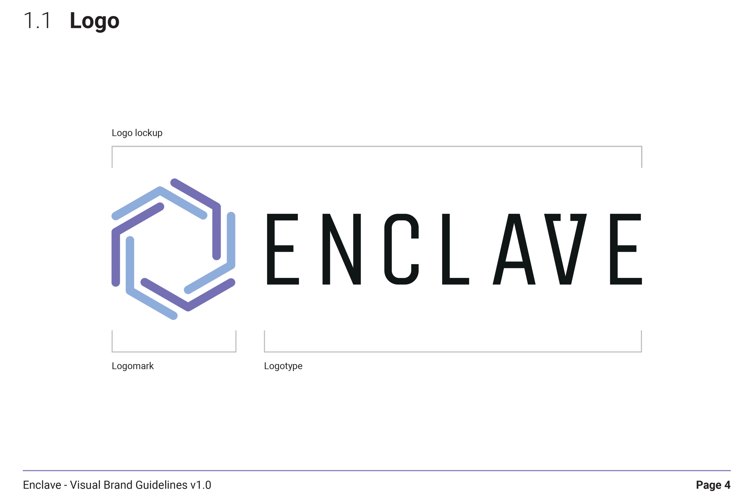
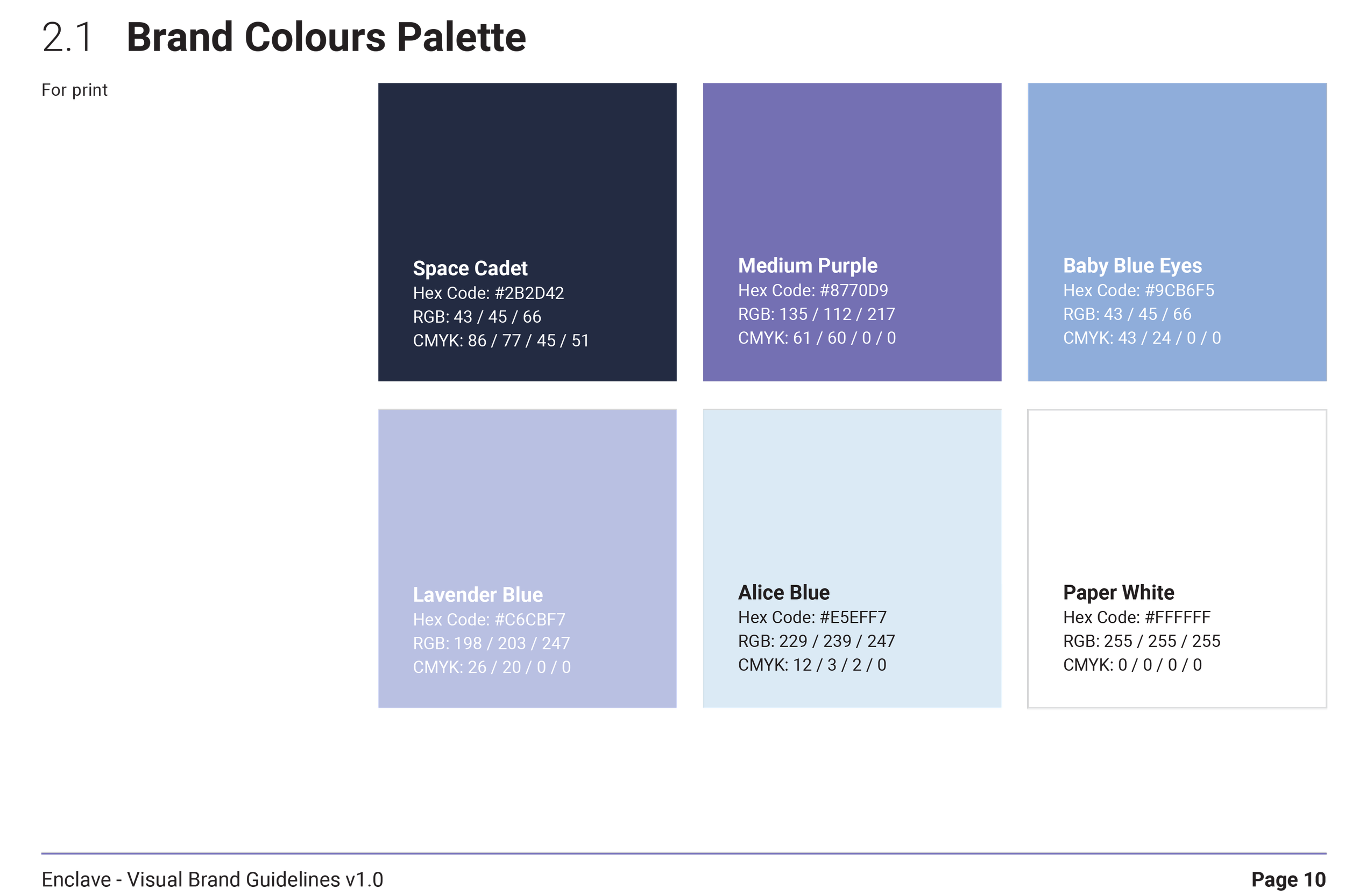
Working closely with the founders and leadership team, I developed a complete visual identity including the logo, colour palette, typography, iconography and brand guidelines. The new brand was designed to communicate security, simplicity and trust while remaining flexible enough to work across the product, website, marketing materials and partner communications.
Enclave's existing identity lacked consistency and didn't fully reflect the maturity of the product.
As the business grew, different teams were producing assets independently, resulting in an inconsistent experience across customer touchpoints.
The challenge was to create a recognisable brand that would:
Build trust with prospective customers.
Differentiate Enclave in a competitive cybersecurity market.
Support future product growth.
Create consistency across digital and marketing channels.
The Problem
Before exploring visual concepts, I worked with stakeholders to understand Enclave's vision, values and positioning within the cybersecurity market.
I reviewed competitor brands, identified common visual themes and looked for opportunities to create a more approachable identity. Rather than relying on familiar cybersecurity clichés, we wanted the brand to feel modern, confident and accessible.
This discovery phase helped define the design principles that guided every branding decision.
Understanding the Problem
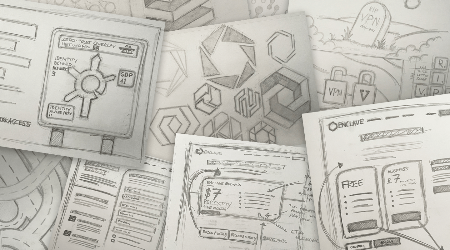

The identity was built around the idea that security doesn't need to feel complicated.
I explored multiple logo concepts, typography combinations and colour palettes before refining a direction that balanced professionalism with simplicity.
The visual language focused on:
A clean, modern logo.
A restrained colour palette inspired by trust and technology.
Consistent typography for product and marketing.
Simple iconography.
Flexible layouts that worked across digital and print.
Every decision was documented within comprehensive brand guidelines, giving the business a single source of truth as the team continued to grow.
Designing the Solution
Rather than delivering individual assets, I created a reusable brand system that could be applied consistently across every customer touchpoint.
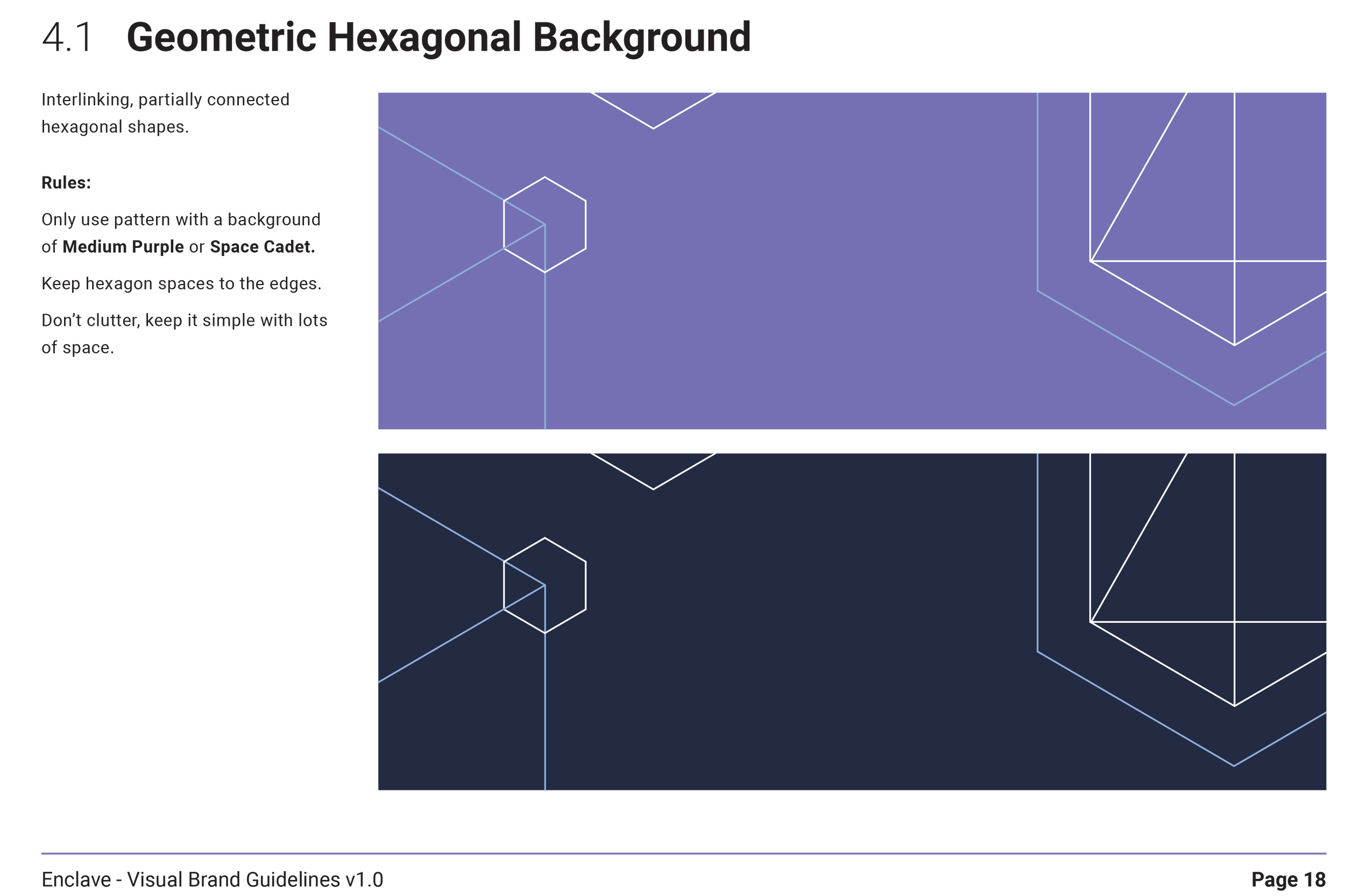
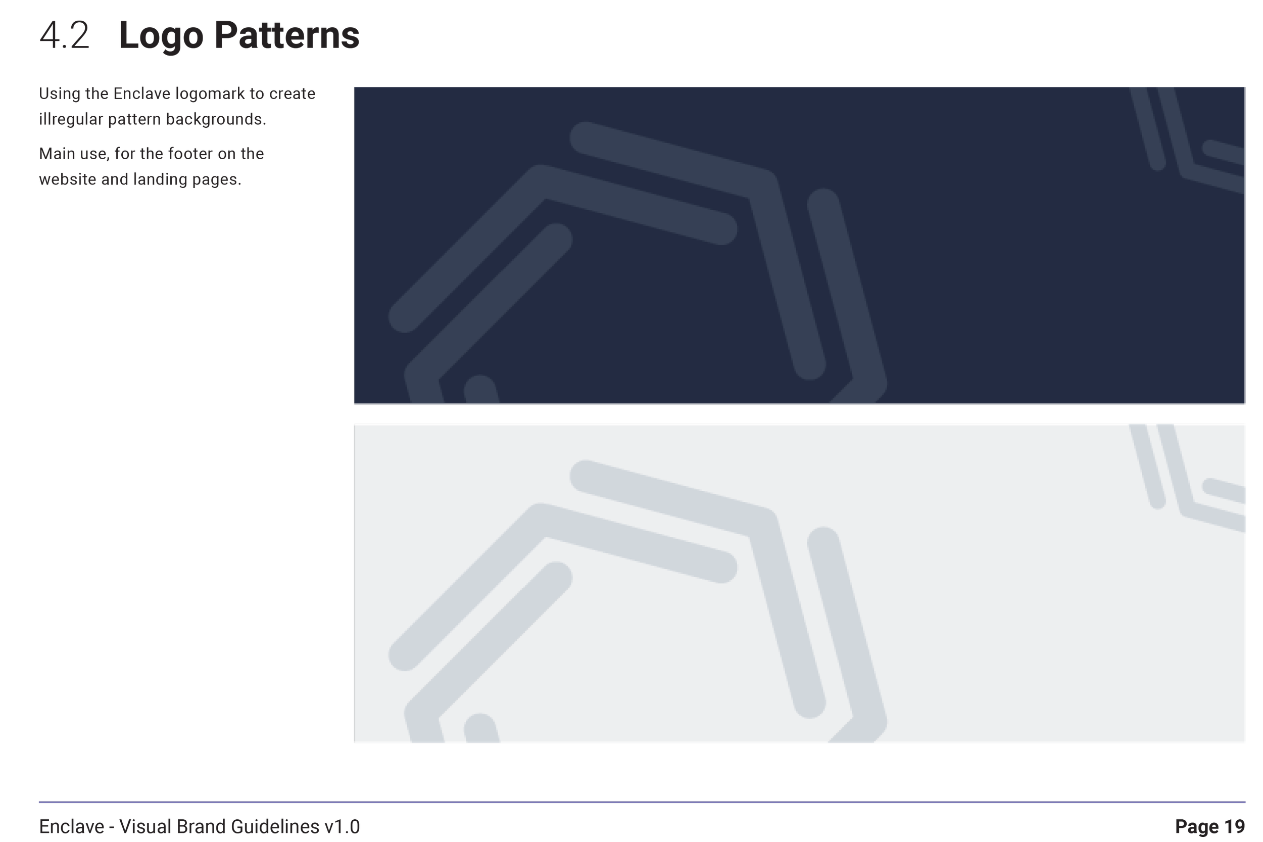
The guidelines covered logo usage, colour, typography, imagery, iconography and layout principles, making it easier for internal teams and external agencies to produce consistent work.
This foundation also aligned closely with the product's Design System, helping create a seamless experience between marketing and the application itself.
Creating a Consistent
Brand System
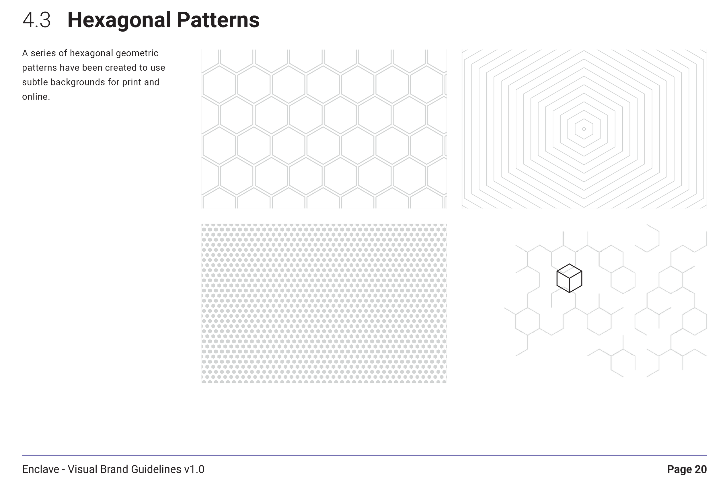
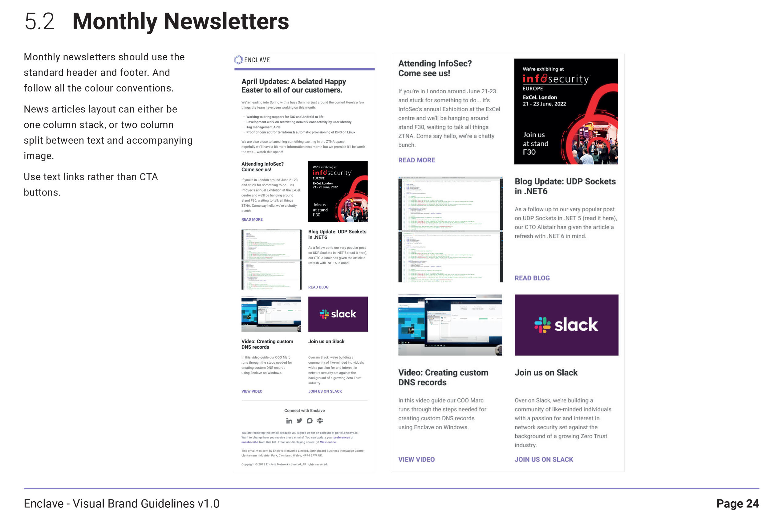
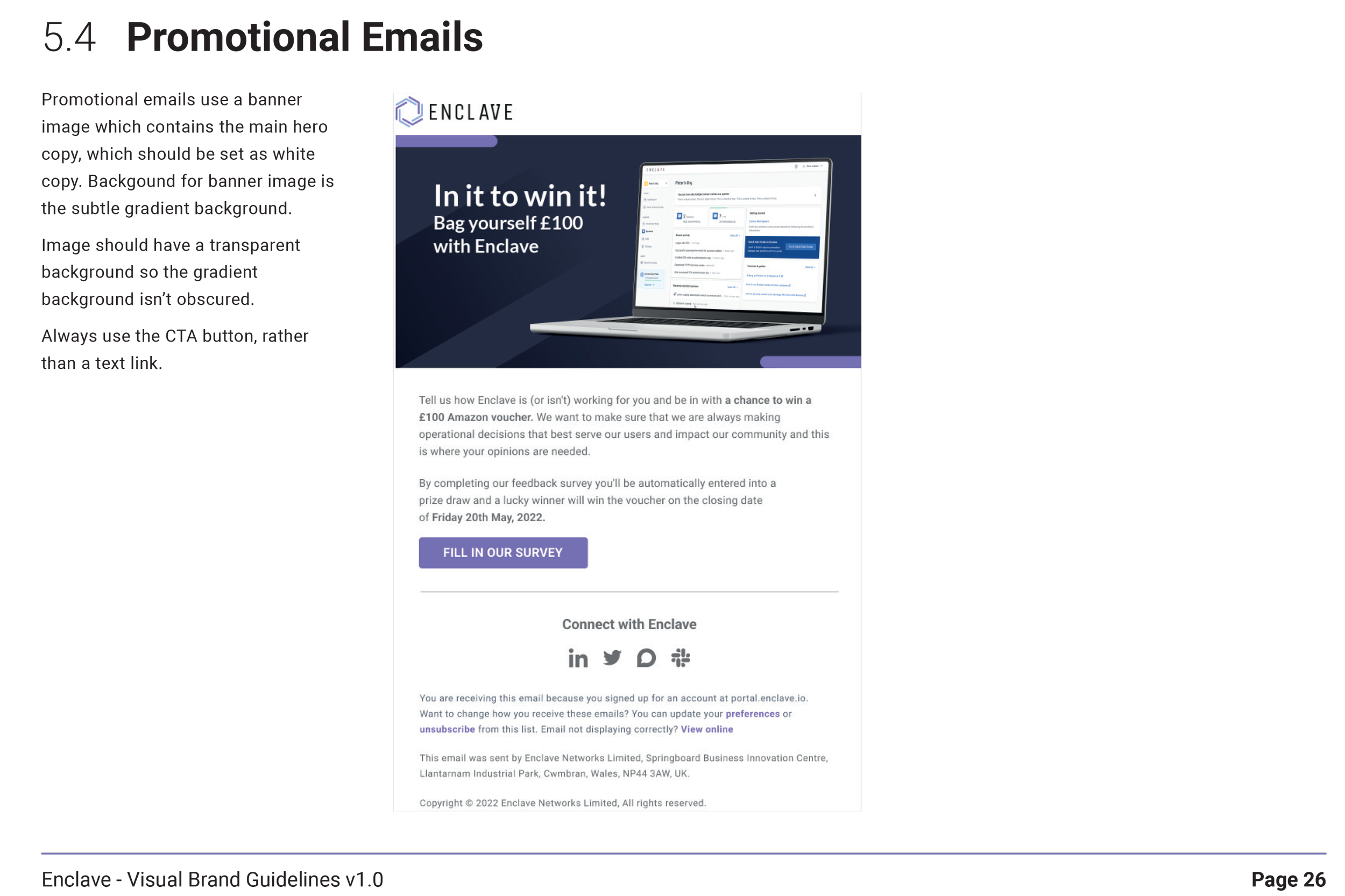
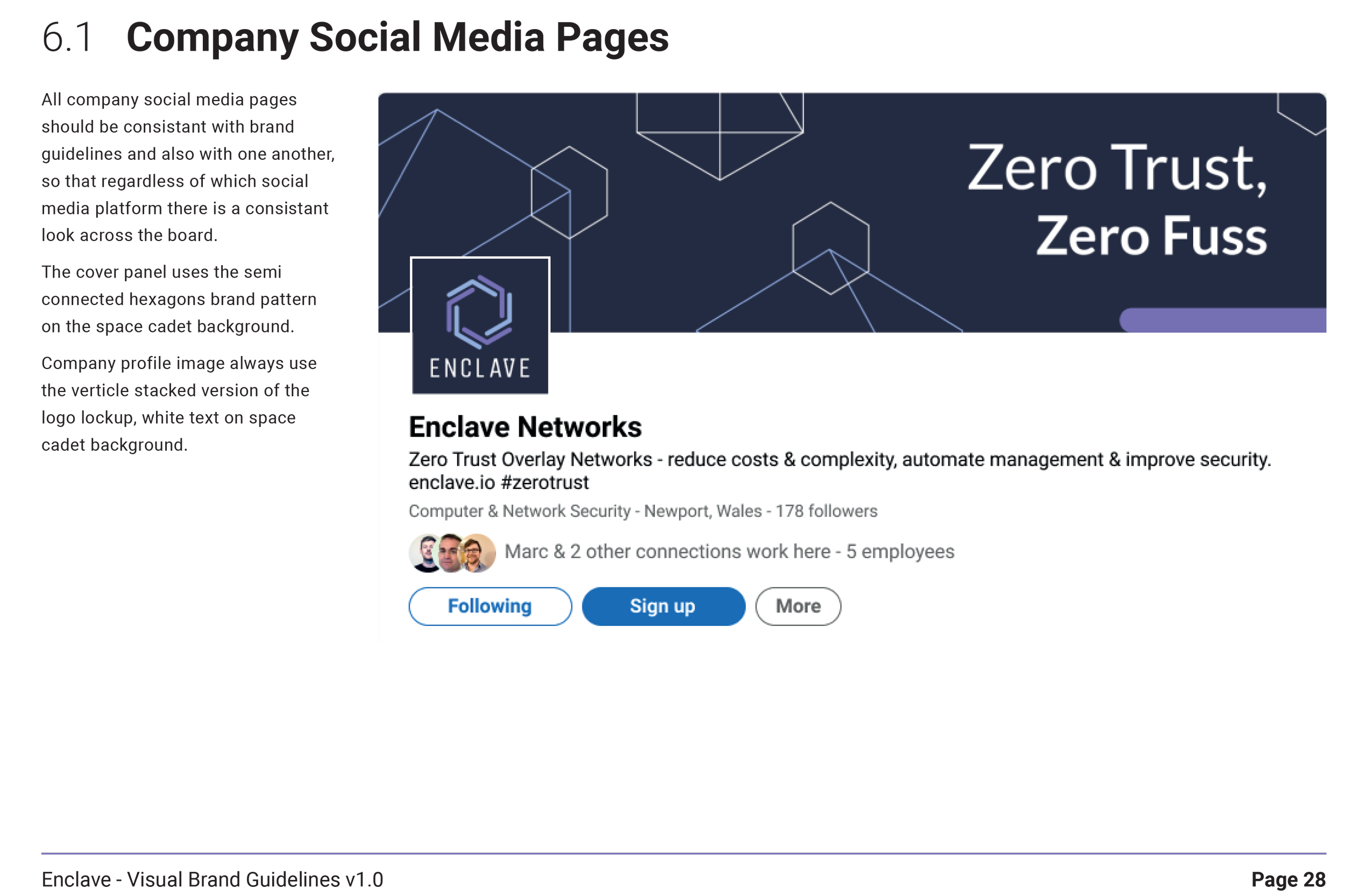
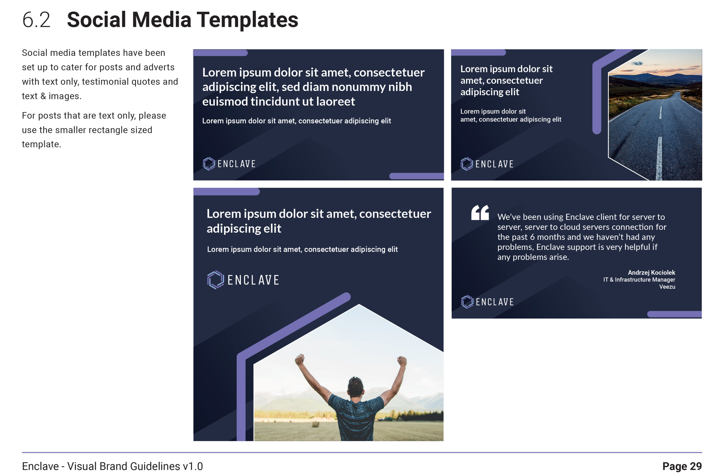
Throughout the project, branding concepts were reviewed collaboratively with founders and stakeholders to ensure the identity reflected Enclave's vision and resonated with its target audience.
Feedback focused on questions such as:
Did the brand communicate trust and security?
Did it feel distinctive within the cybersecurity market?
Would it scale across product and marketing?
Was it flexible enough for future growth?
Regular iterations helped refine the identity before rolling it out across the business.
Testing
The completed brand provided Enclave with a consistent identity that could be used confidently across every part of the business.
Deliverables included:
New company logo.
Colour palette.
Typography system.
Iconography.
Brand guidelines.
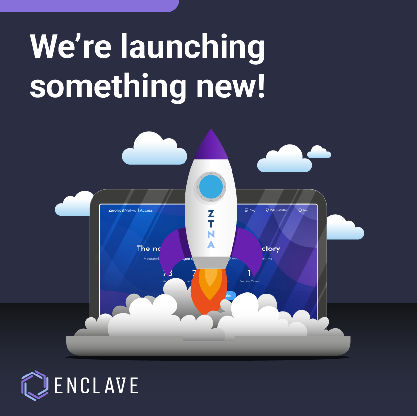
Marketing assets.
Social media templates.
Brochures and sales collateral.
The new identity established a strong visual foundation that supported both the product and the company's growing presence in the cybersecurity market.
Final Product
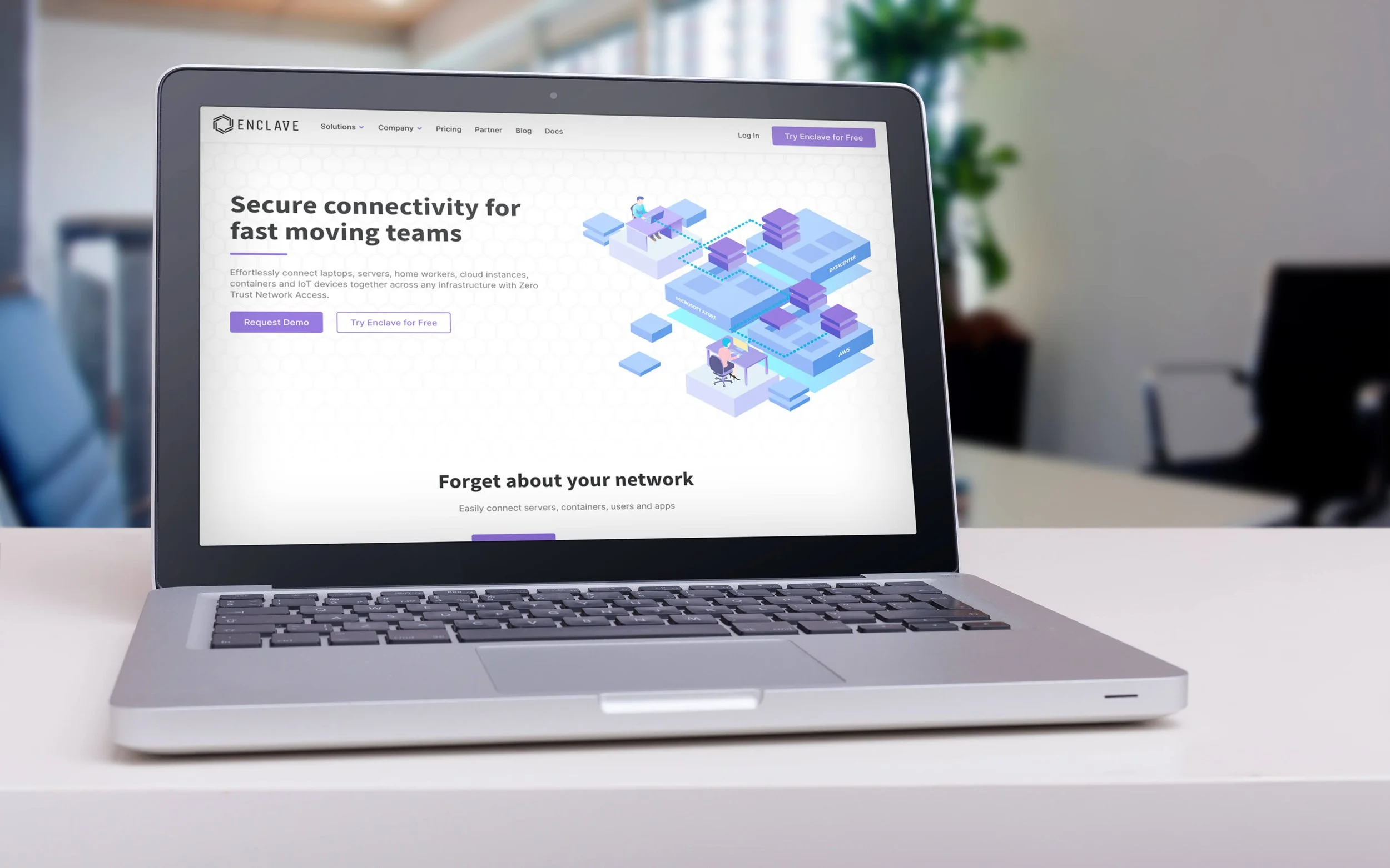
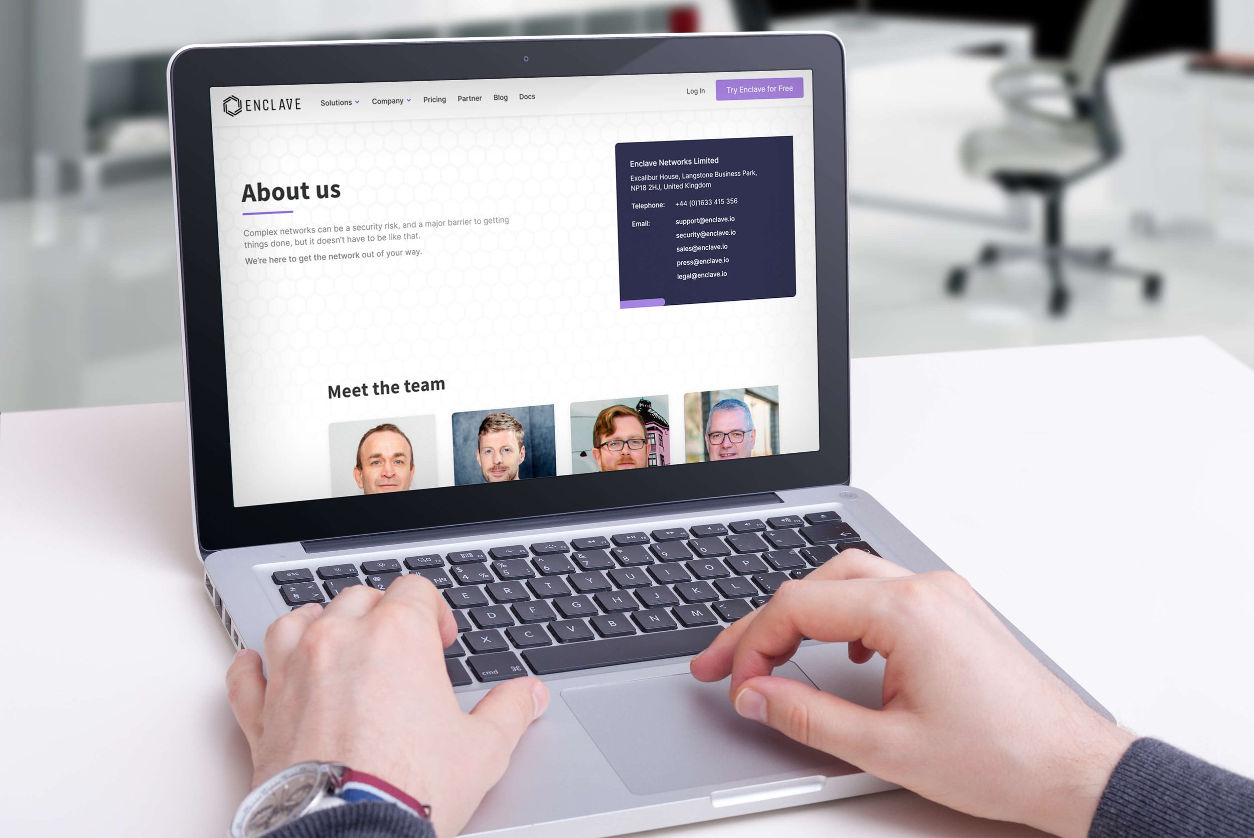
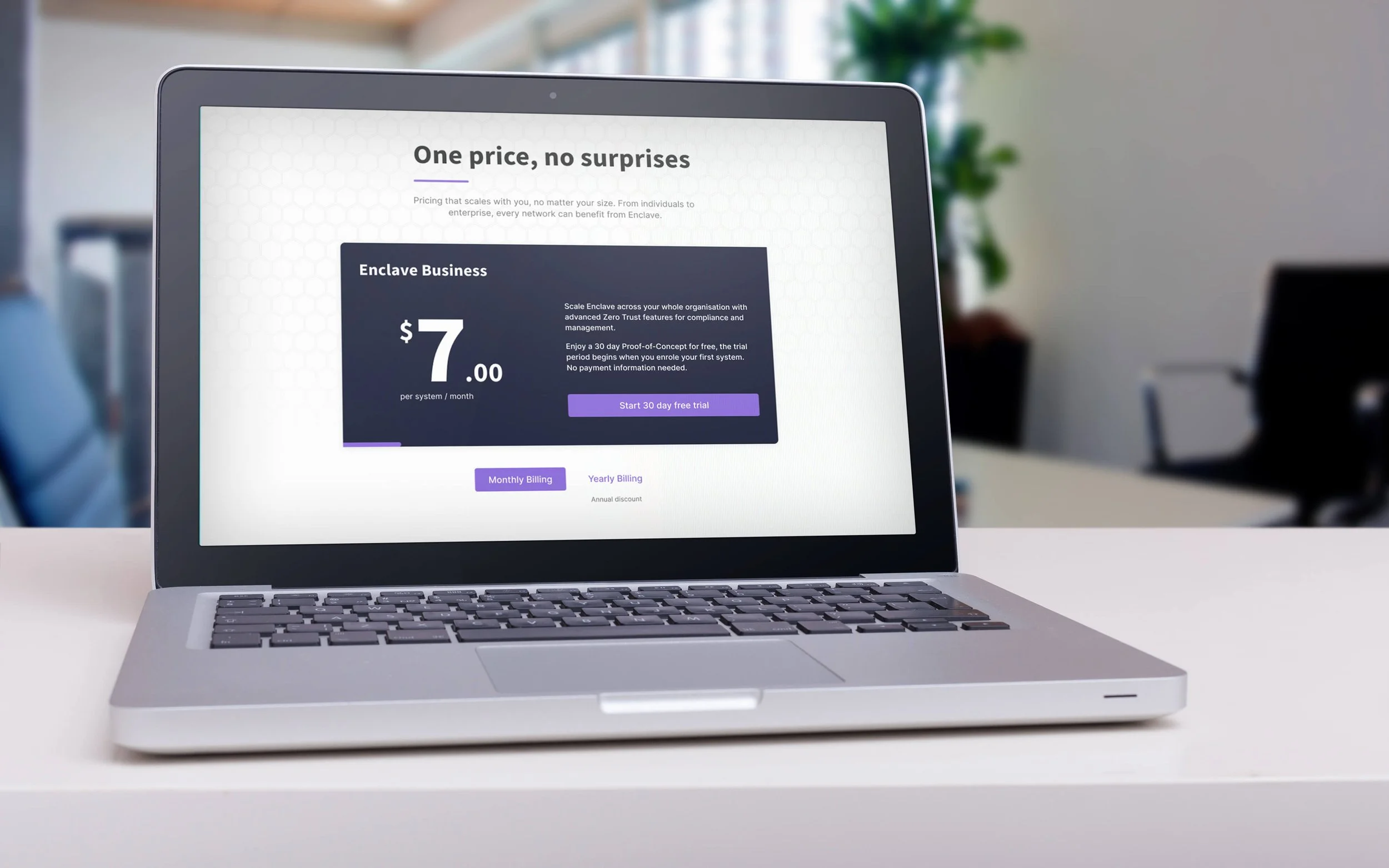
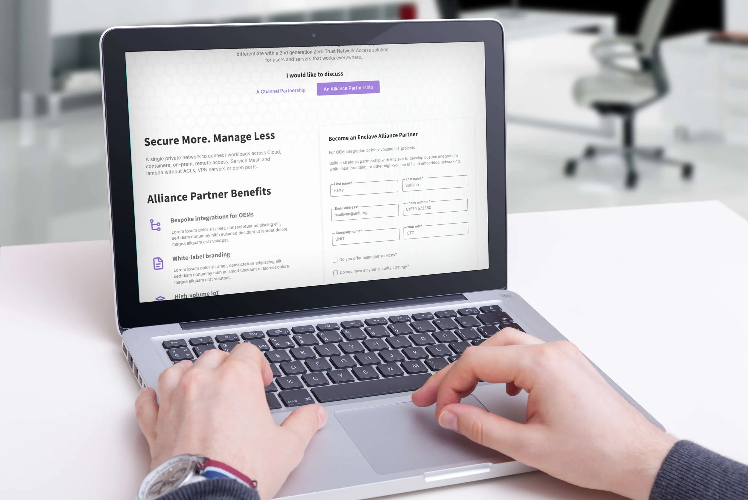
The branding project helped create a more consistent and professional experience across Enclave's customer touchpoints.
The project delivered:
A unified visual identity across product and marketing.
Comprehensive brand guidelines for internal teams.
Faster production of marketing materials through reusable assets.
Greater consistency across digital and print communications.
A scalable foundation that supported the company's continued growth.
Measuring Success
This project reinforced that branding is about much more than a logo.
Creating a successful identity meant understanding the business, its customers and the values it wanted to communicate. By developing a flexible brand system rather than a collection of individual assets, I helped establish a consistent visual language that supported both marketing and product design.
As Enclave's only designer, I also highlighted the value of thinking holistically, ensuring every customer touchpoint felt like part of the same experience.
Reflection